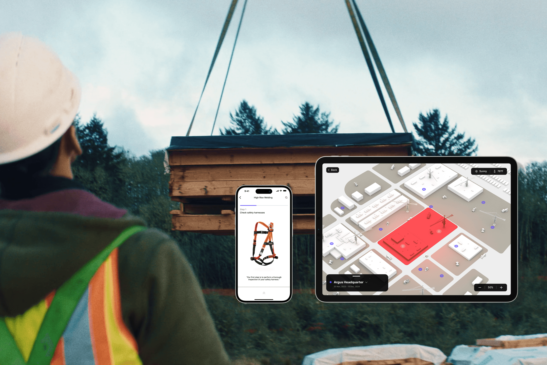
Argus
2024
Argus


A system designed to enhance communication and safety on construction sites.
My Roles
Visual Lead
UI Lead
Prototyping Lead
Tools
Figma
Adobe Suite
Rhino
Keyshot
Categories
UX UI / Product Design
Team
Jiwon Lee, Project Manager
Fletcher Leese, Product Designer
Preetika Gulati, UX Researcher
Timi Dare, UX Researcher
Why?
Problem
1
fatal construction accident occurs every
10
mins.
The construction industry faces increased safety risks and project delays due to inefficient hazard reporting, miscommunication, and language barriers on construction sites, highlighting the urgent need for solutions.
How?
Design Process
Over 20 weeks, we conducted secondary research and user interviews, created personas and user journey maps, developed intuitive designs, iterated on them, and performed usability testing to ensure Argus is people-first. Ultimately, we delivered an innovative solution.
What?
End Product
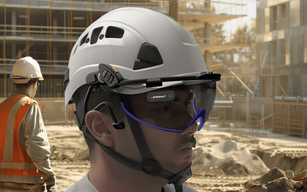
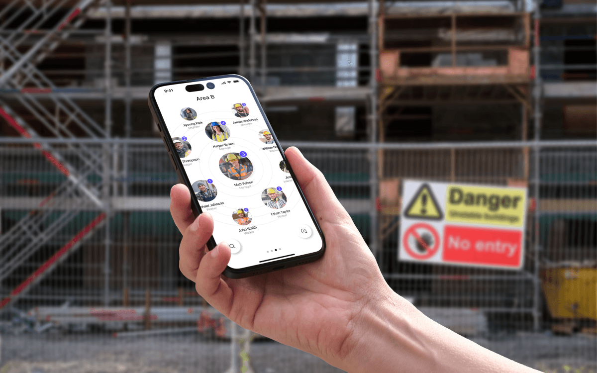
We designed a comprehensive system that includes an AR smart visor along with a mobile and tablet interface to provide a safer construction environment, break language barriers, and increase efficiency.
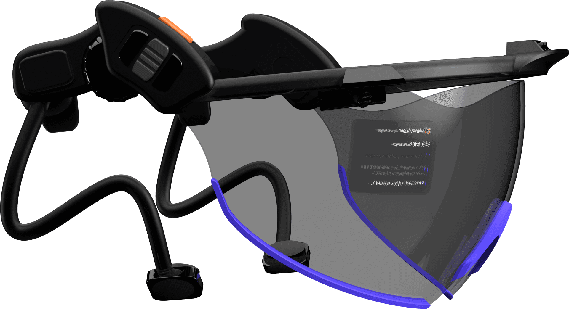
Smart Visor
Working seamlessly in real-time helping inform the user of potential hazards, and enhance communication and task management.
View features

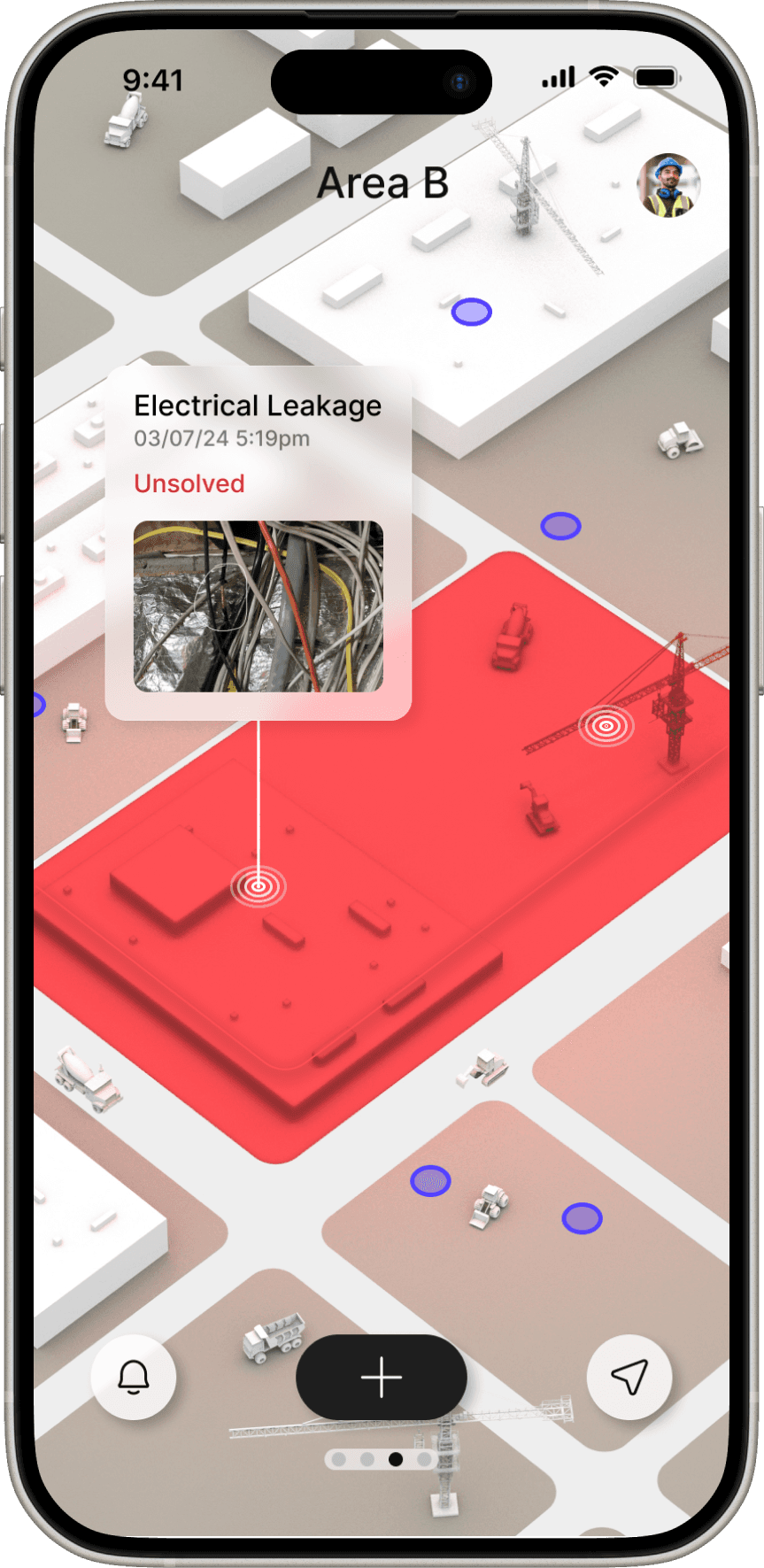
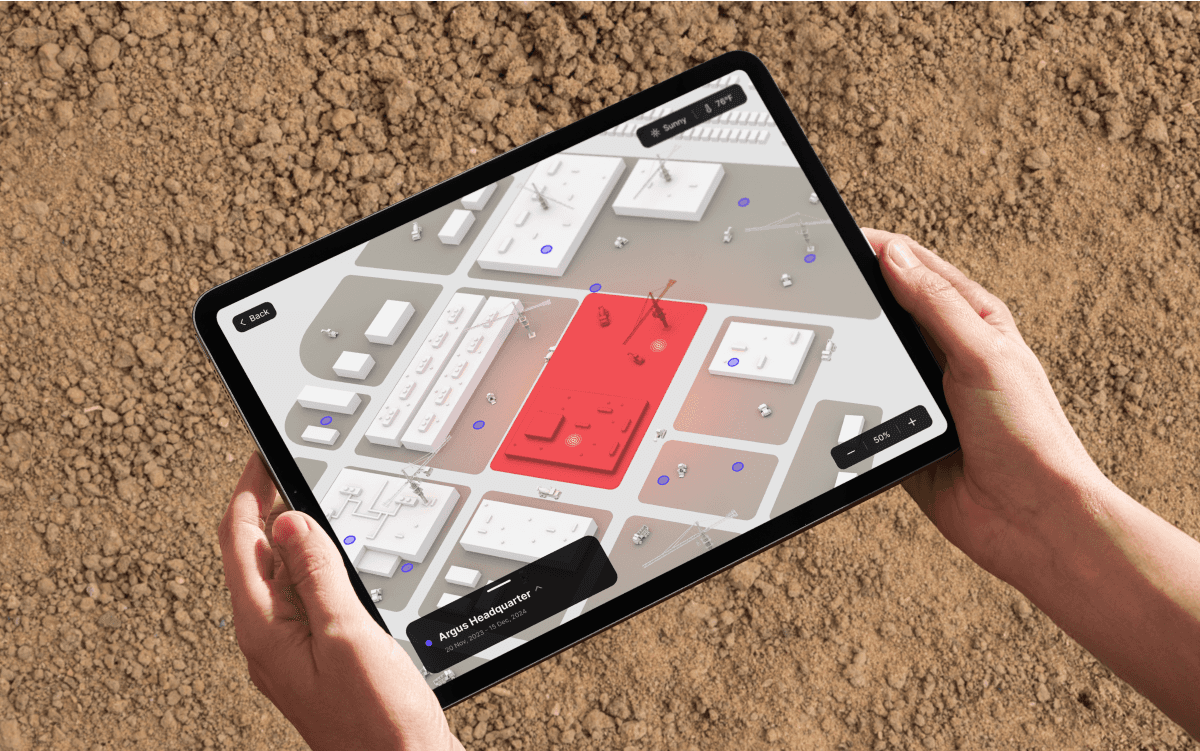
3D Site Map
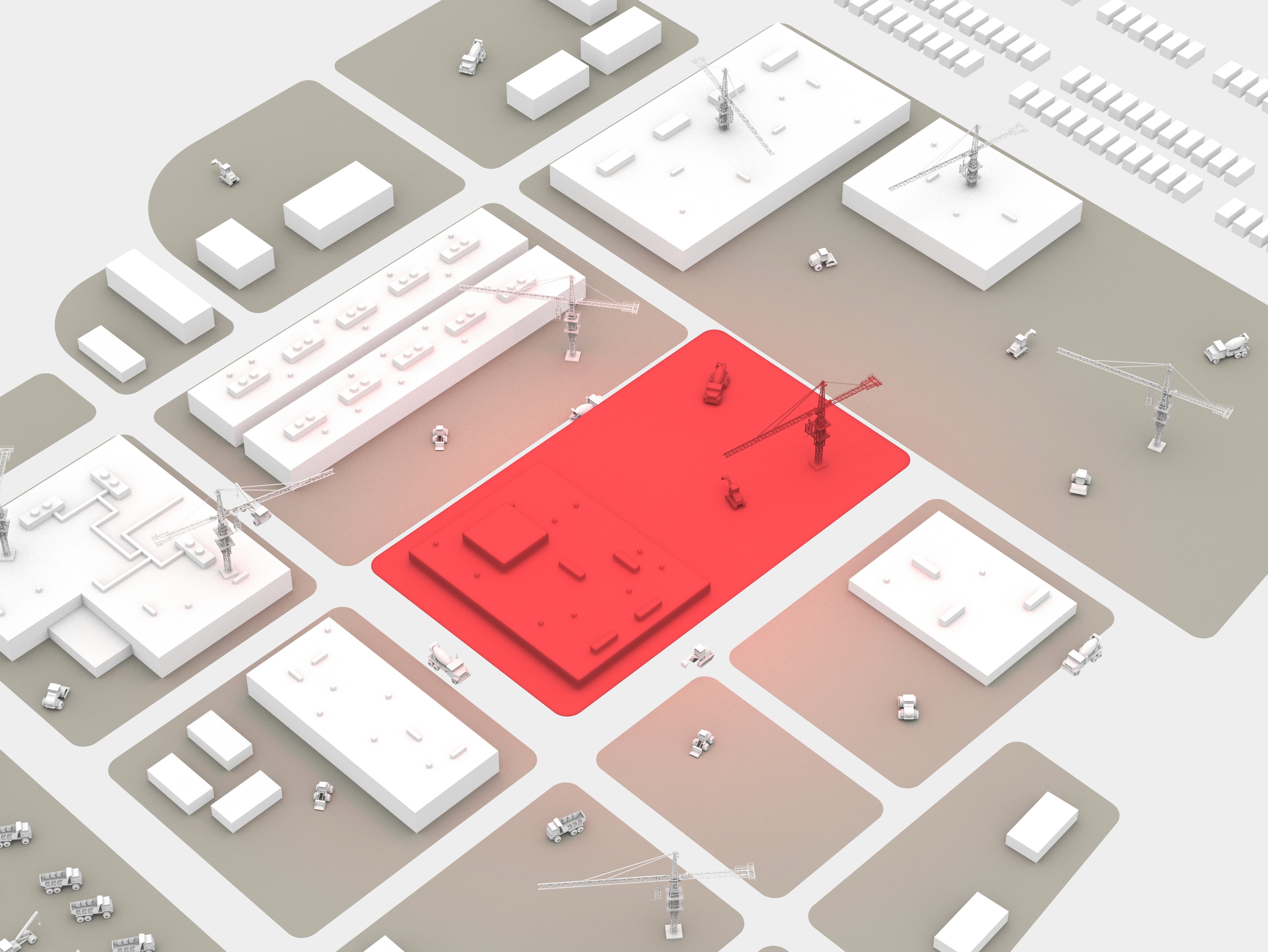
Integrating 3D maps to identify hazardous zones and worker locations. Fostering better situational awareness and improved collaboration..
Tablet
Helping managers oversee site operations and enforce safety protocols
with a comprehensive interface for task management, hazard reporting, and direct worker communication.

Back
|
50%
|
Sunny
|
76ºF
20 Nov, 2023 - 15 Dec, 2024
Argus Headquarter
Task List
New Task
All
12
Today
05
To-do


In Progress


Research
Off the bat, there were a few things we had to examine
How does on-site construction work?
What kind of struggles do target users have?
How could we help to solve their challenges?
Secondary Research
Our team conducted extensive research to build a solid understanding of the construction industry. This effort was focused on gaining insight into on-site activities and identifying the challenges they present.
1/5
of all work-related deaths happen
in the construction industry in the US every year.
60,000
fatal accidents occur each year
on the construction site world wide.
67%
of employers said that miscommunications due to language barriers were leading to inefficiency.
Interviews
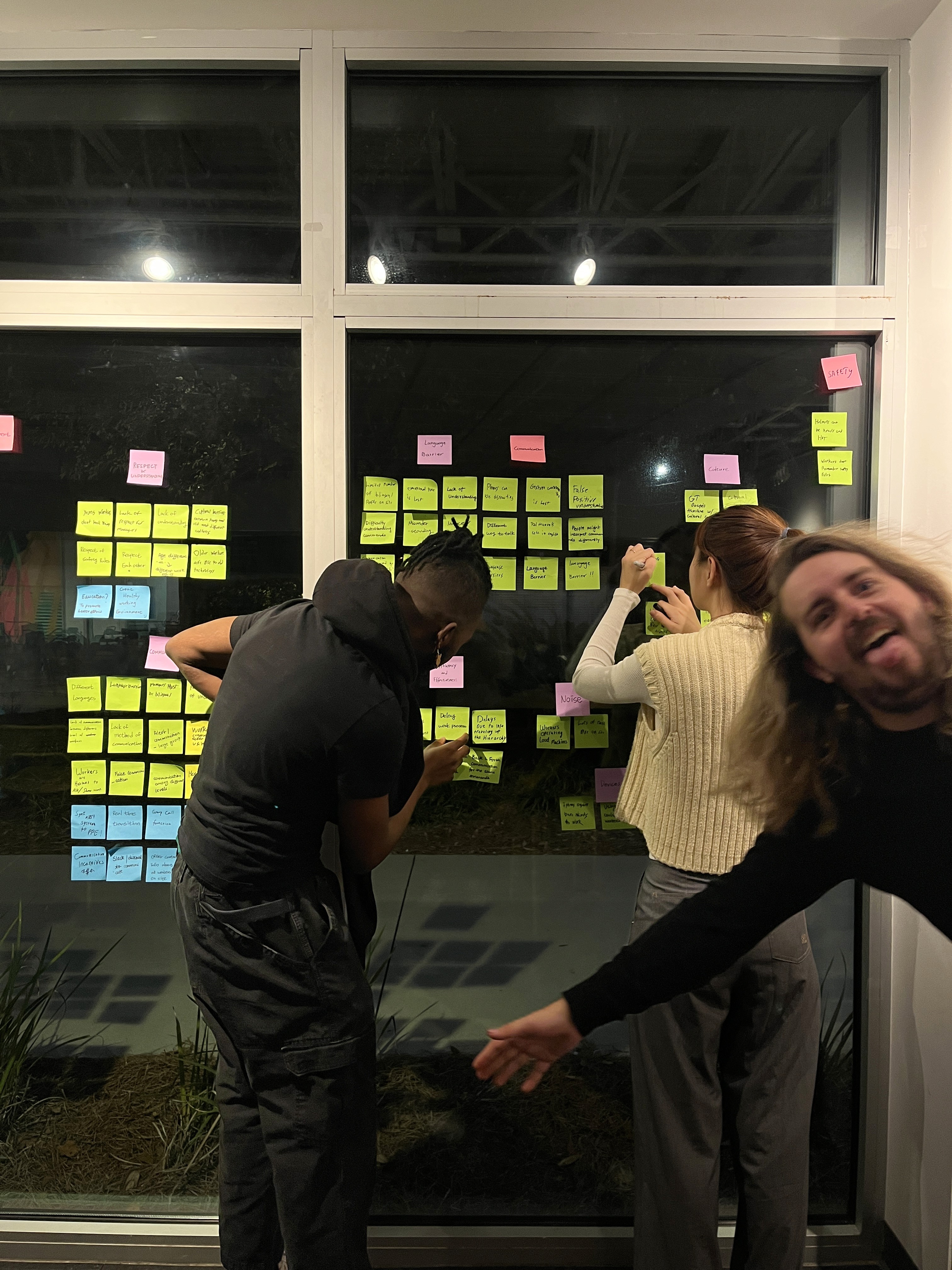
To gain deep insights into the construction industry, we adopted an ethnographic method, conducting primary research directly on construction sites. This hands-on approach allowed us to collect valuable, nuanced data directly from those deeply embedded in the industry.
10+
experts
- AI Product Designer @IBM
- UX Designer @Procore
- IT Project Manager @Bright View
- Construction Safety Managers
- Senior General Contractors
- Business owners
55
workers
interviewed 55 construction workers across 7 different sites in Georgia.
- 1 Metaplant (Hyundai America)
- 4 mid-size sites
- 2 small-size sites
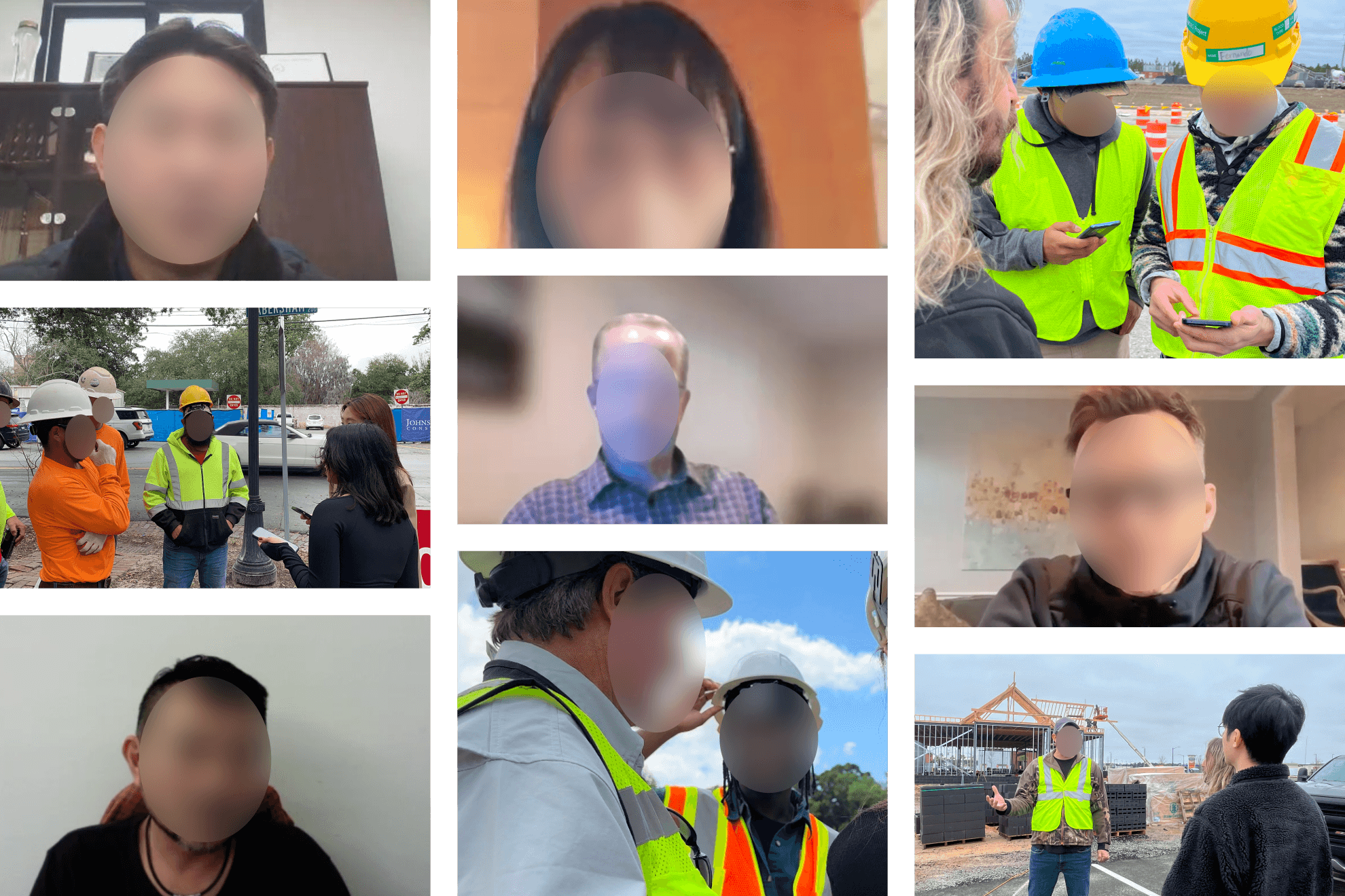
Interview Images
Affinitization
Individual Observations
Survey Data
Interview Quotes
Collaborative Themes
Common Traits
Data Correlations
Overarching Patterns
Recurring needs, and shared characteristics across multiple themes.
User's Needs
Priorities
Pain Points
35
110
352
3
Insights
In research, we discovered the following fundamental problems ->
Communication gaps and language barriers led to frequent misunderstandings.
Safety hazards remain a major concern despite training and new equipment.
A lack of effective training systems leads to costly mistakes and inefficiencies.
Product Ideation
Figuring out the approach
To tackle these problems, we conducted an ideation session using the Crazy 8 method. This approach enabled us to develop practical, innovative solutions that directly addressed the users' pain points.
Smart Visor
Bone Conduction
LiDAR Sensors
OLED Projector
Mobile / Tablet Applications
3D Mapping Tool
Messaging System
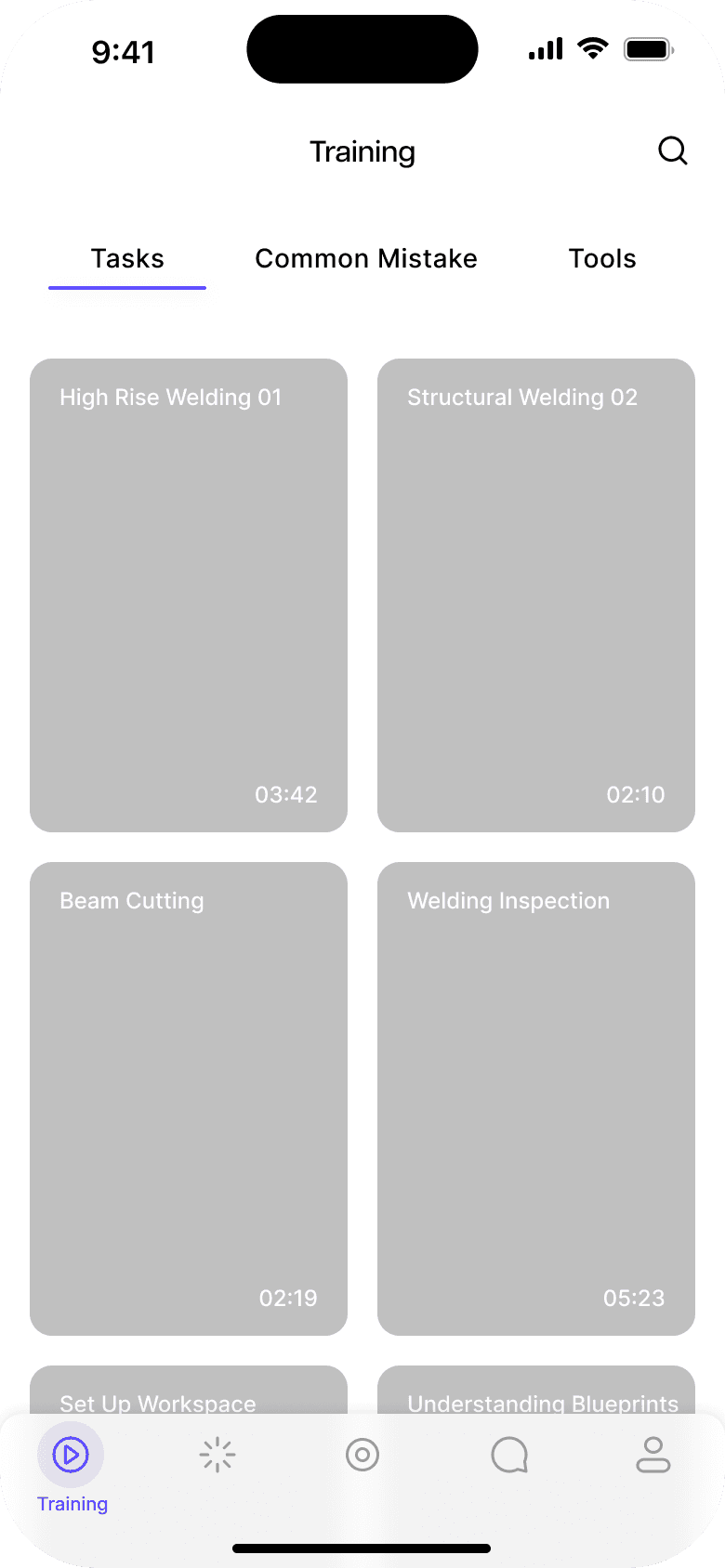
Safety Training
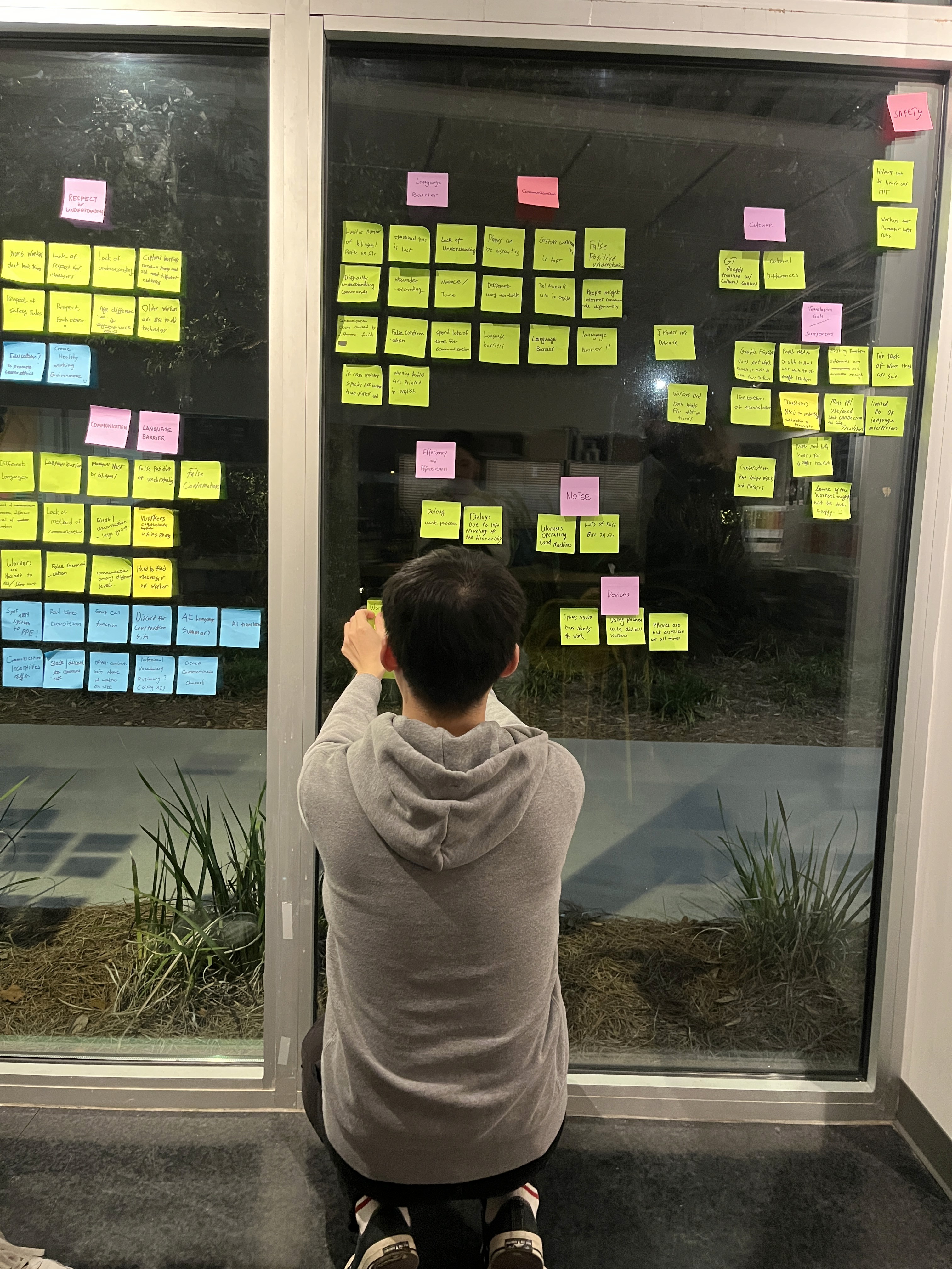
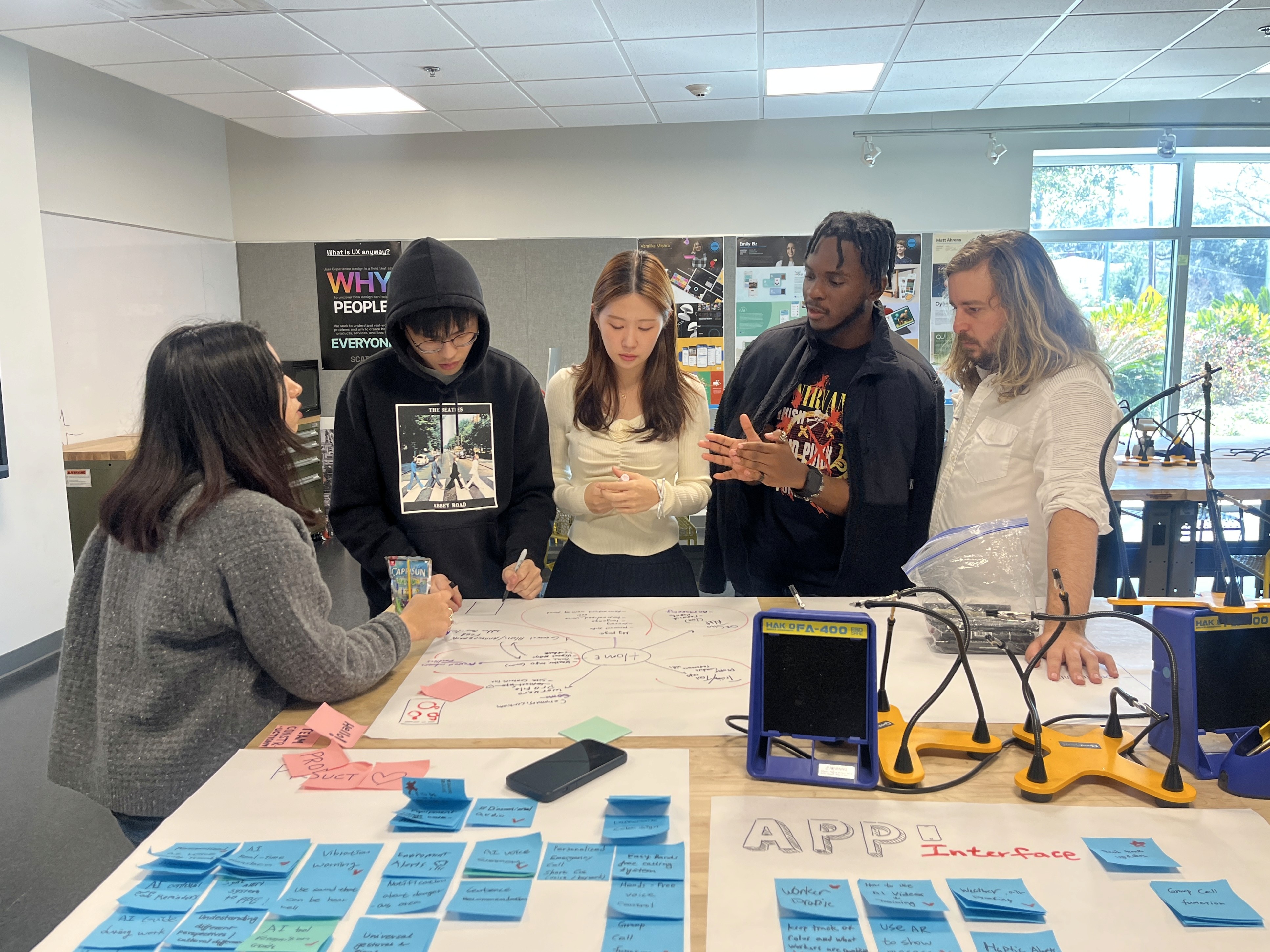
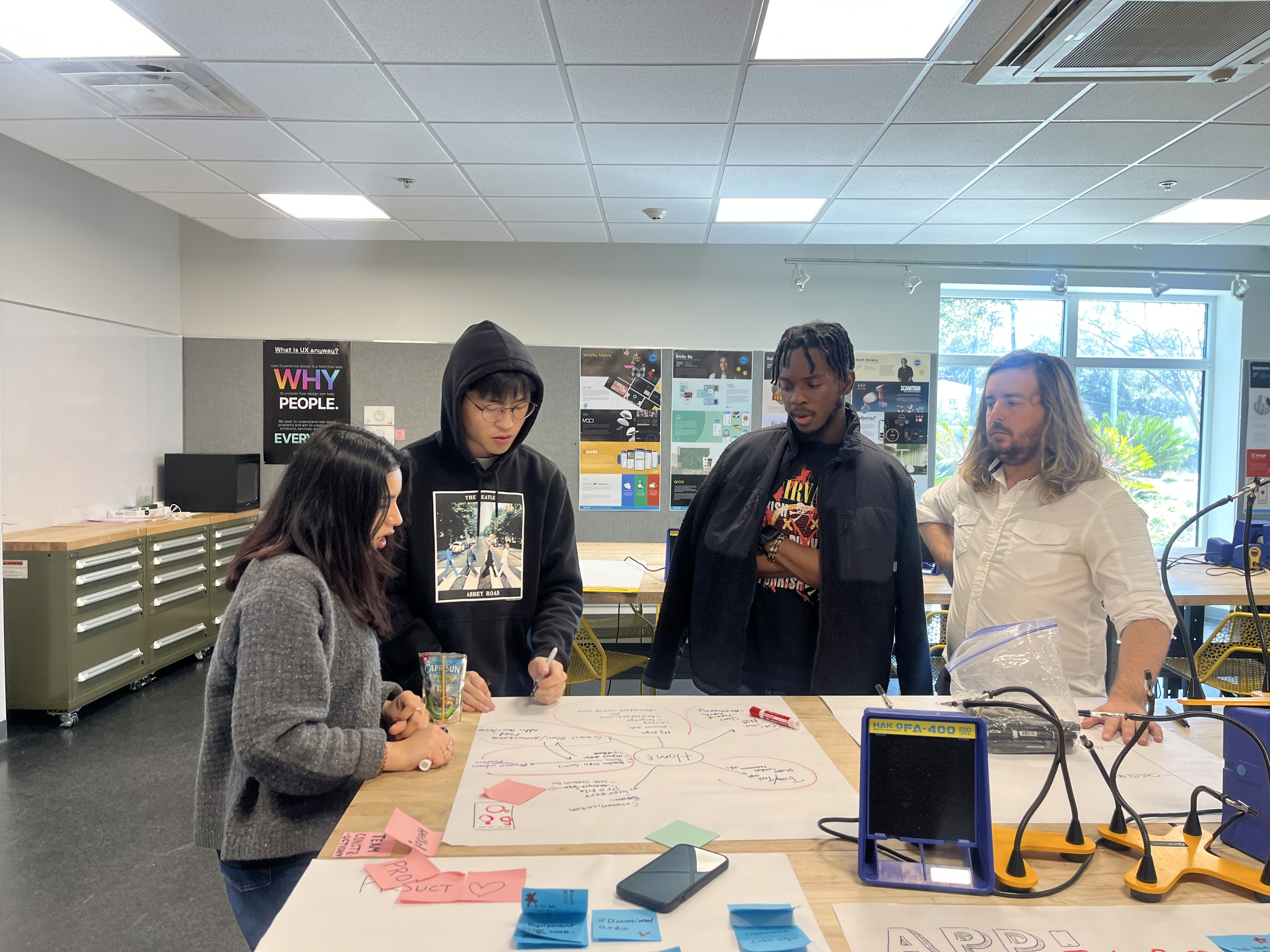
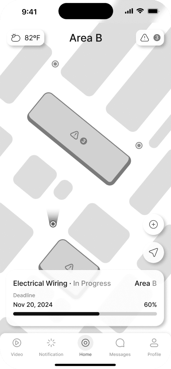
Ideation and Wireframing
Site Map
Scope and structure
Onboarding
Home
Site Map
Training
Message
Profile
Hazard Report
Site Overview
Hazard Zone
Translation
Worker Location
Summary
Tasks
Tools
Common Mistakes
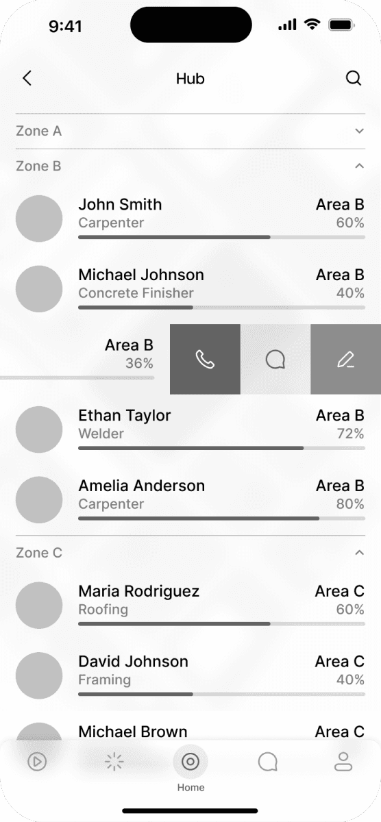
Contacts
Messages
Mid-Fi to Hi-Fi Prototype
Hover for Comparison
User Testing Findings
How will users behave?
With our initial concept in hand, we felt confident in our solution but it was time to step back and see what we could learn from our stakeholders. What usability issues were present? How could we optimize user experience and enhance customer satisfaction? These questions would guide our process.
The design is not sufficiently user-friendly for the practical usage scenarios of the end-users, especially for construction workers with larger hands.
Traditional UI layouts are not well-suited for the high-pressure environment of construction sites, leading to readability issues.
The user flow is overly complicated, which impedes efficient navigation and increases user confusion and errors.
Improvements
See Solution
Rethinking user experience details for better.
Optimize the design by increasing button size, spacing, and touch target areas to accommodate users with larger hands.
Redesign the UI layout with larger fonts, and clear iconography to enhance readability in diverse lighting conditions and reduce cognitive load.
Simplify the user flow by reducing the number of steps required to complete key tasks.
Consistent. With a Design System.
Based on insights gained from user research, we consolidated core user needs that drove the development of our comprehensive design system.
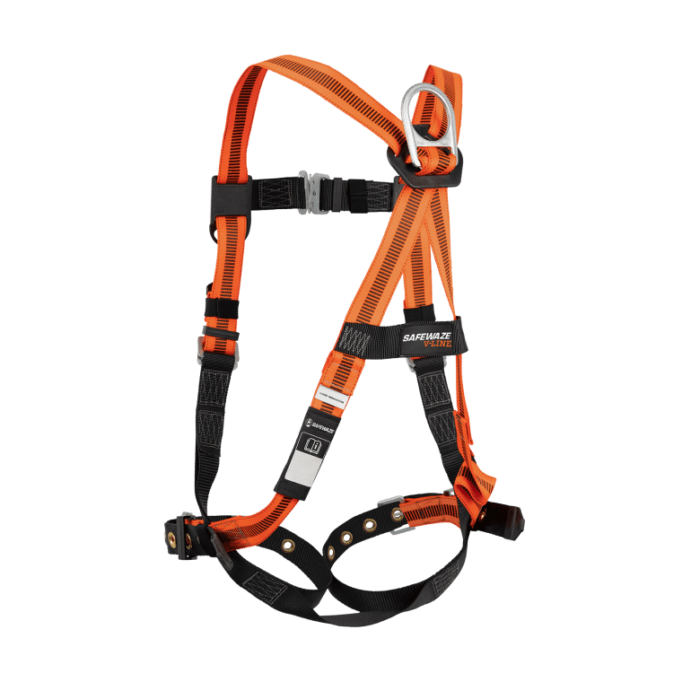
“Our first step is to perform a thorough inspection of your safety harness.”
Step 1
Check safety harnesses
Tasks
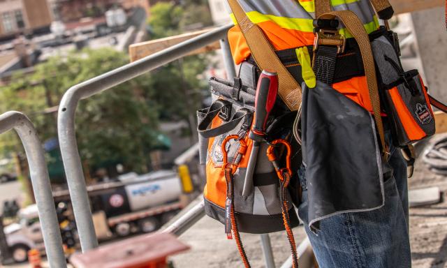
Improperly secured tool lanyards
Comprehensive guidance on safely and effectively utilizing angle grinders.
Project Name
Area
B
8% Behind schedule
60%
Dec 15, 2023
Nov 20, 2024
Details
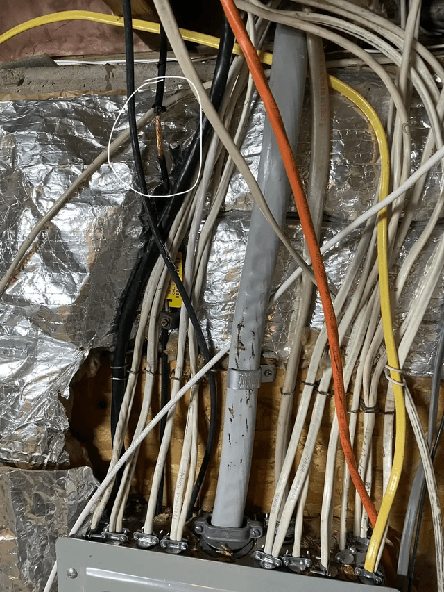
Electrical Leakage
03/07/24 5:19pm
Reported

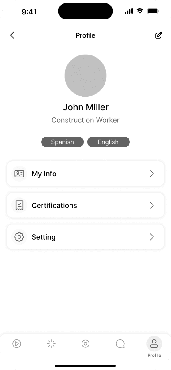
John Miller
Construction Worker
My Voice Shortcut
0:04
Call Safety Manager
0:04
Call Project Manager
0:06
Hazard Report
Translation Language
Spanish
English
Inter
Aa
Inter - Bold
Inter - Medium
Inter - Regular
Inter - Light
Headline 1 - Regular 5rem 20px
Headline 2 - Medium 4rem 16px
Headline 3 - / Medium 3.5rem 14px
Body 1 - Medium 4rem 16px
Body 2 - Medium 3.5rem 14px
Body 3 - Medium 3rem 12px
Body 4 - Medium 2.5rem 10px
Button 1 - Medium 4rem 16px
Button 2 - Medium 3rem 12px
#5340FF
Primary
90
80
70
60
50
40
30
20
10
05
Secondary
#000000 (90)
90
80
70
60
50
40
30
20
10
05
Background
#FFFFFF
Success
#339929
Error
#B80409
Warning
#FFD518
Reflection
Great design balances aesthetics with real user needs.
Be flexible in the design process. Focusing on the actual needs and priorities of users, ensuring the design is both technically sound and user-centric. Adapting to the changing requirements and feedback from users, creating a product that truly addresses their pain points
Hi! This is the bottom.
© Josh Lu 2024
v2.0.0
Aug '24
