Blick
2022
BLICK
A website redesign to transform the BLICK Shopping Experience, by simplifying the interface and enhancing the information hierarchy.
My Roles
UX Research
UI Design
Prototyping
Tools
Figma
Adobe Suite
Categories
UX UI Design
Why?
Problem Statement
BLICK's website had a dated design and lacked an intuitive user experience, making it difficult for art enthusiasts and professionals to navigate and find products efficiently.
How?
Design Process
Conducted user research through surveys and usability tests to understand pain points and behavior patterns. Identified key areas of improvement such as navigation, interface, and product categorization.
What?
End Product
We revamped the BLICK website by improving its navigation, enhancing product pages with clearer descriptions and larger images, and streamlining the item-finding process for a smoother user experience. The redesign not only improved usability but also created a more engaging and efficient shopping experience for users.
Existing: Home Page
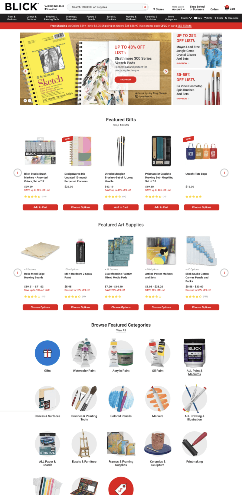
The homepage is packed with multiple product sections, banners, and categories without sufficient breathing room between them. This creates a sense of information overload and makes it hard for users to focus on any one section.
Unclear Visual Hierarchy. Featured promotions, products, and CTAs lack clear distinction, which results in scattered user attention
Categories like "Gifts," "Watercolor Paint," "Acrylic Paint," and others don't stand out, making it difficult for users to find specific products quickly.
There are too many products listed in multiple sections without clear guidance on what’s most important. Users are left to navigate a sea of products with little direction.
Special offers promotion, are not visually prominent. The offer is cluttered within other elements on the page, causing users to overlook it.
The navigation bar contains many categories, making it overwhelming and difficult for users to find what they’re looking for.
Redesigned: Home Page

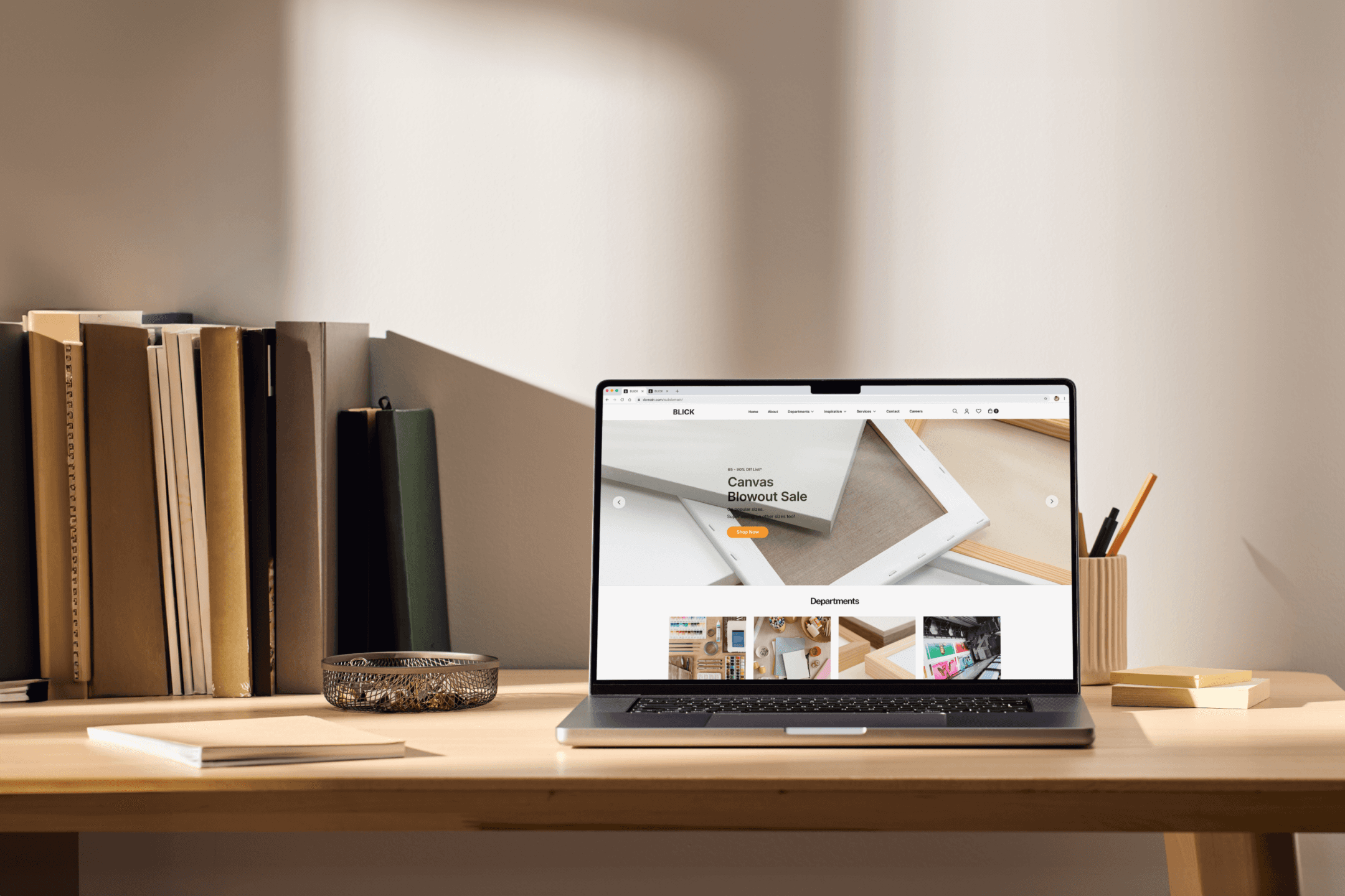
The redesign simplifies the layout by introducing more white space between sections, creating a cleaner, more organized structure. The use of larger images and fewer product categories per section makes it easier for users to scan and engage with key elements.
Established a clearer visual hierarchy, placing key promotional content prominently with larger text and clear images. Primary sections are better separated with bold headings.
Used larger, bolder images for key categories to improve visibility. This helps direct users’ focus toward important categories, reducing confusion and improving navigation.
Reduced the number of products displayed on the homepage and groups them into clearer sections with more distinct categories.
Promotional sections, such as the "20% OFF" and "Make with Earth Day in mind" offers, are given distinct spaces with bold imagery and countdowns to create urgency and increase interaction.
The redesigned navigation bar uses broader, simpler categories and streamlining the options and making it easier for users to navigate.
Existing: Product Page
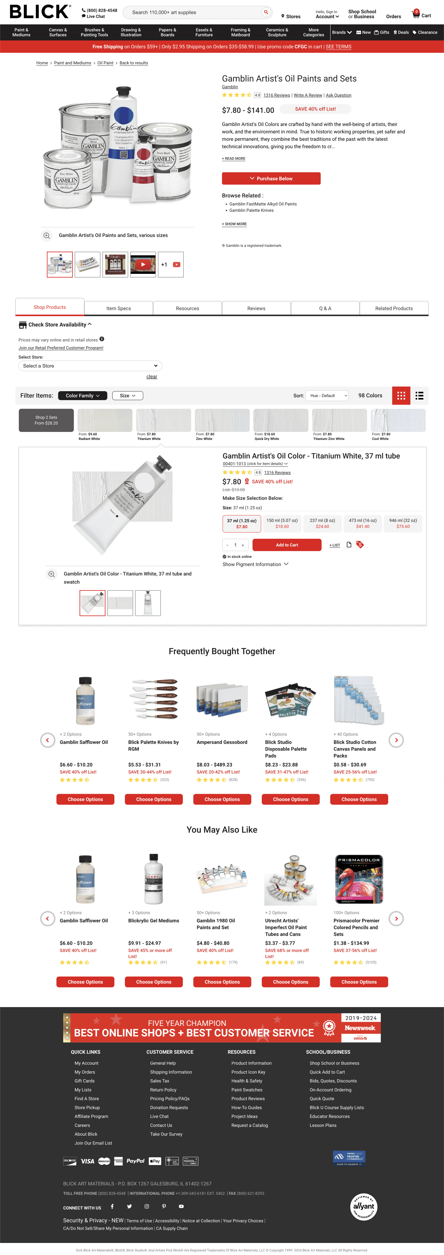
The homepage is packed with multiple product sections, banners, and categories without sufficient breathing room between them. This creates a sense of information overload and makes it hard for users to focus on any one section.
Lack of clear visual hierarchy, making it difficult for users to quickly identify the most important information.
All product details displayed at once, creating information overload.
High contrast red and white scheme feels dated and aggressive
Too many products listed in "frequently bought together" and "you may also like" sections. The section lacks emphasis, making it harder for users to find deals.
The available space is not used effectively, leading to a cramped and disorganized appearance.
Redesigned: Produt Page
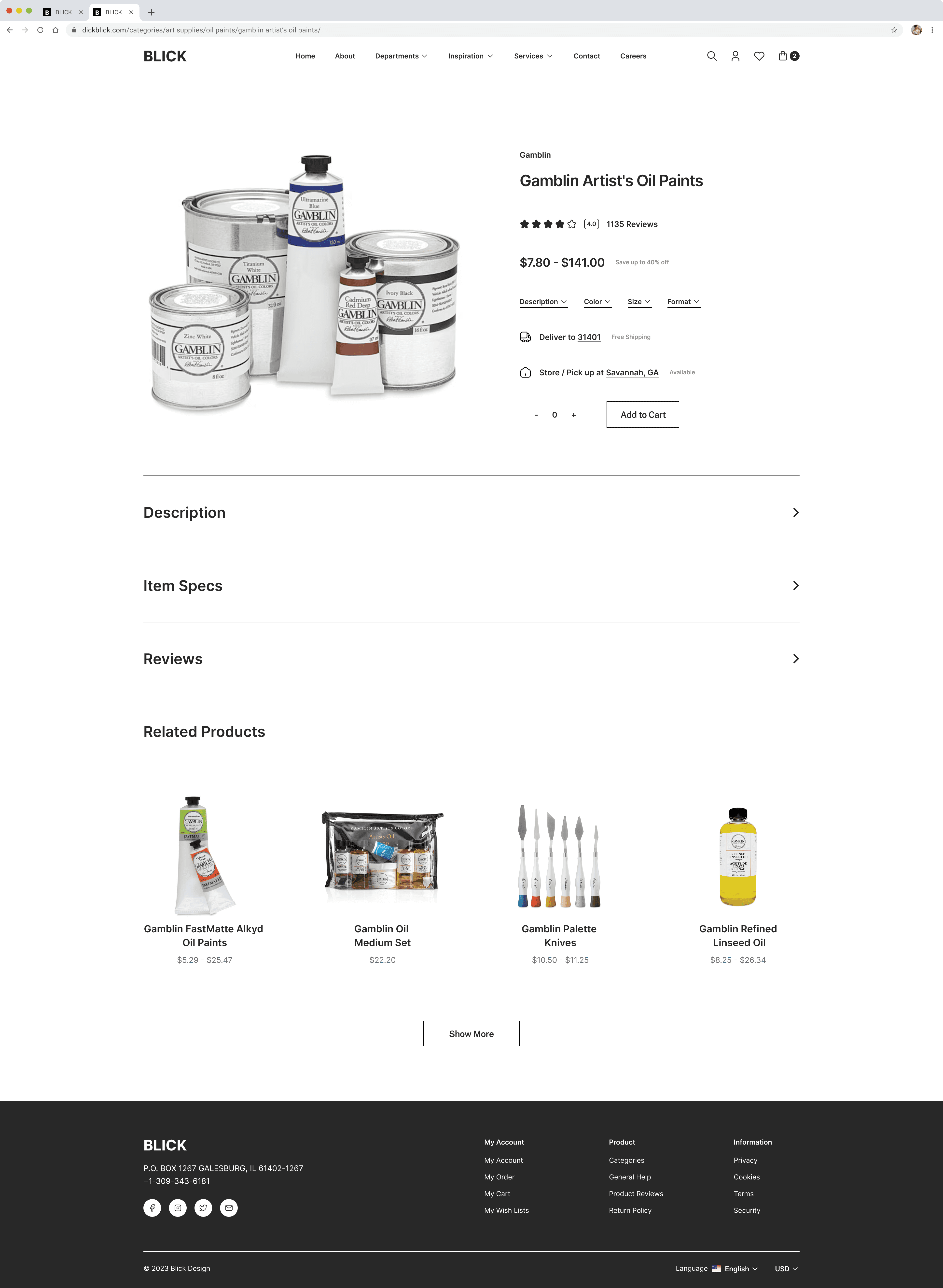
Subtle, clean color palette with primary black text on white background.
Highlight top-related products more effectively with larger space.
Clear visual hierarchy with larger product title, prominent pricing , and a more noticeable add-to-cart button.
Large, high-quality product image taking up about 50% of the above-fold space. White background enhances product visibility.
Information segmented into expandable sections, allowing users to focus on specific information as needed.
Takeaways
The Essence of utilizing Hierarchy and Clarity.
This project taught me the value of simplifying layouts to improve user focus and engagement. By enhancing visual hierarchy and using clear CTAs, I saw how strategic design choices drive interaction. Streamlining navigation highlighted the importance of balancing discoverability with ease of use, while aligning visuals with brand identity built trust with users. Overall, the redesign reinforced the impact of thoughtful design on usability and satisfaction.
Hi! This is the bottom.
© Josh Lu 2024
v2.0.0
Aug '24